Difference between revisions of "Development/Treeview/Historical"
(Update image links) |
(→+XX .. link: remove link to outdated page that won't be migrated) |
||
| (One intermediate revision by the same user not shown) | |||
| Line 62: | Line 62: | ||
==== User responses to 1.2 Treeview improvements ==== | ==== User responses to 1.2 Treeview improvements ==== | ||
* Though the improvement to performance has been welcomed, user response to the redirected browse page when seeking to view all children in the treeview was mixed. Users felt that the difference in sort order and visual style between the Treeview and search results was disorienting, and removed necessary context. Uniquely identifying the parent description in a human-readable manner in the search query also proved to be difficult - the description title is the natural choice, but titles are not unique in many collections. In addition the search results page is not hierarchical so it cannot be used to descend or ascend the description hierarchy. | * Though the improvement to performance has been welcomed, user response to the redirected browse page when seeking to view all children in the treeview was mixed. Users felt that the difference in sort order and visual style between the Treeview and search results was disorienting, and removed necessary context. Uniquely identifying the parent description in a human-readable manner in the search query also proved to be difficult - the description title is the natural choice, but titles are not unique in many collections. In addition the search results page is not hierarchical so it cannot be used to descend or ascend the description hierarchy. | ||
| − | ** To encourage design discussion on a dedicated hierarchy browser page, a | + | ** To encourage design discussion on a dedicated hierarchy browser page, a separate wiki page was created for discussion on how best to proceed. Currently the page holds one suggestion for a [http://en.wikipedia.org/wiki/Miller_Columns Miller column view]; <strong>community users are encouraged to offer further suggestions and wireframes/mock-ups.</strong> |
* Problems have also been identified with nesting multiple child levels in a visual display with limited screen real-estate, as the treeview currently exists on the right or left hand side of the screen (depending on the [https://www.ica-atom.org/doc/Themes theme selected]). As users drill down to lower levels, the nesting provided for less and less room to display label information (such as title, identifier, etc.). | * Problems have also been identified with nesting multiple child levels in a visual display with limited screen real-estate, as the treeview currently exists on the right or left hand side of the screen (depending on the [https://www.ica-atom.org/doc/Themes theme selected]). As users drill down to lower levels, the nesting provided for less and less room to display label information (such as title, identifier, etc.). | ||
| Line 337: | Line 337: | ||
== +XX .. link == | == +XX .. link == | ||
| − | *As part of the | + | *As part of the Scalable UI controls upgrades the total number of resources shown in the '''Treeview''' was restricted. In cases where there are more than ten (10) resources at any level of the hierarchy, only the first 10 resources will be displayed, with an '''+XX... link''' showing the number of hidden resources at that level. Clicking the link will expand that branch to show ''all'' descriptions at that level. |
** Original discussions on this requirement can be found in issue 1068, and more specifically, issue 1303. | ** Original discussions on this requirement can be found in issue 1068, and more specifically, issue 1303. | ||
| Line 358: | Line 358: | ||
[[File:Treeview_3.png|500px|center|thumb|Figure 2:Show screen for file 18 out of 33]] | [[File:Treeview_3.png|500px|center|thumb|Figure 2:Show screen for file 18 out of 33]] | ||
| − | |||
| − | |||
== Natural sort == | == Natural sort == | ||
Latest revision as of 13:57, 20 July 2015
Main Page > Development > Development/Treeview > Development/Treeview/Historical
On this page you'll find an overview of the some of the history, early development considerations, and analysis undertaken when designing the treeview for ICA-AtoM, some of the changes and enhancements introduced in later versions, and user feedback and development suggestions received at that time. For more current information about the Treeview in AtoM, please see the following pages:
Note
This page contains the historical development documentation for the treeview in ICA-AtoM and AtoM, which was originally added to an earlier development wiki (Qubit Toolkit). The content was originally created in January of 2010, and was last updated January 28, 2013. Changes to layout may have been made below to account for stylistic differences between the two wikis, and dead links may be removed or updated. Otherwise, the content is the same. New content relating to the treeview will be added to the 2 sections linked above.
Contents
Introduction
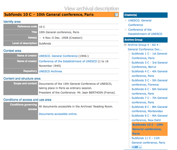
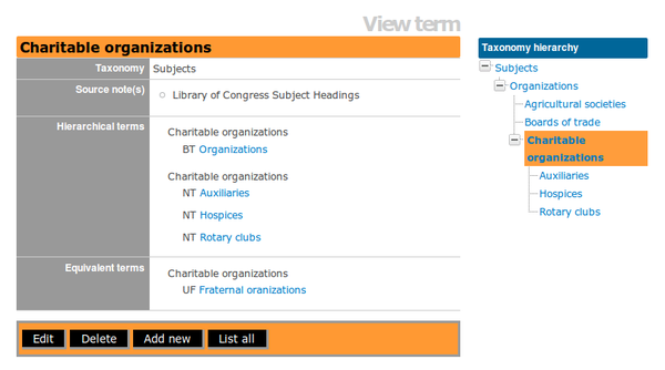
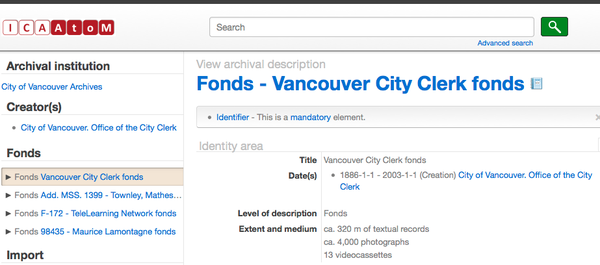
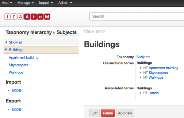
The Treeview is a graphical representation of the current resource hierarchy (ascendants and descendants). The Treeview structure is used with archival descriptions and taxonomy term pages. In the archival description page, the Treeview gives a graphical representation of the description hierarchy, revealing the relationship between parent-level description (e.g., fonds or collection) and lower child-level descriptions (e.g, series, file, item). On the archival description page, the Treeview is included within the Context menu area, which includes hyperlinks to the related archival repository, creator's authority record, related physical storage and the Cover flow viewer graphically representing related digital objects. In the term page, the Treeview gives a graphical representation of the taxonomy hierarchy, revealing the relationship between taxonomy type (e.g., subject, places) and broad and narrow terms.
Background
The Treeview has been a feature since early beta versions of the software. The following is a review of the Treeview feature and its functionality in ICA-AtoM 1.2 and 1.3, as well as in AtoM 2.0. The purpose of providing Users with the background of Treeview is to demonstrate the developments of this feature in response to User's feedback, software performance and scalability.
1.2 ICA-AtoM Treeview
- Treeview in Archival description view page
- Presented within the context menu for a selected fonds/collection
- Nested presentation
- Plus and minus signs are used to indicate if a level includes descendents and can be opened further to reveal additional descriptions
- All levels open for viewing
- Highlight is used to indicate specific archival description being viewed
- Users can move archival descriptions within a fonds via drag-and-drop in the treeview
- Fonds/collections with descendent and numerous siblings are displayed in a single page and Users need to click on hyperlink number to view siblings. See "XX...link" discussion below for additional information.
- The +XX or "See all" button in the treeview received reports of performance and usability issues, as parent level descriptions with numerous children would result in loading errors or long wait times. This is best summed up in User Feedback Issue 1943, and related discussions (linked in the issue).
- In response to the issue, changes are made to how ICA-AtoM handles archival descriptions with numerous siblings and a separate browse screen is added, which the user is redirected to when viewing child records beyond the initial 10 treeview records loaded.
- Treeview in Terms view page
- Nested presentation
User responses to 1.2 Treeview improvements
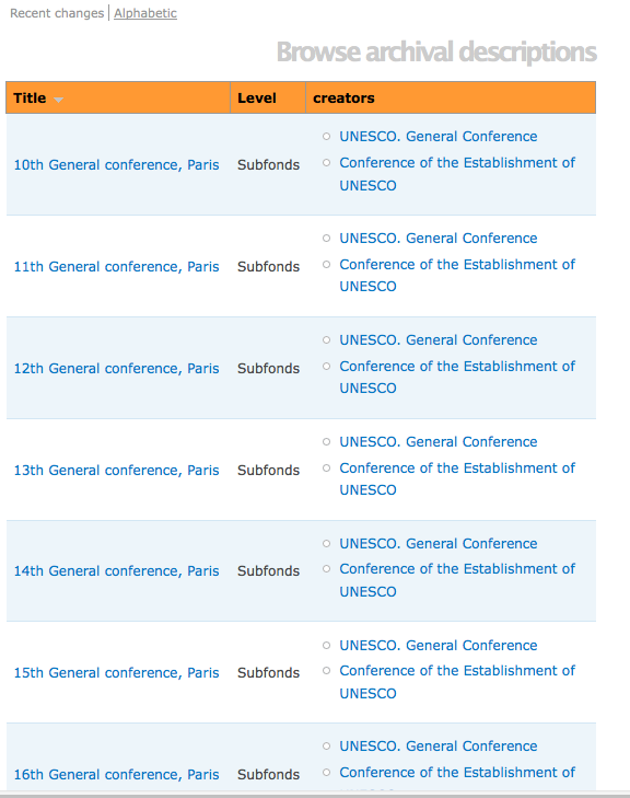
- Though the improvement to performance has been welcomed, user response to the redirected browse page when seeking to view all children in the treeview was mixed. Users felt that the difference in sort order and visual style between the Treeview and search results was disorienting, and removed necessary context. Uniquely identifying the parent description in a human-readable manner in the search query also proved to be difficult - the description title is the natural choice, but titles are not unique in many collections. In addition the search results page is not hierarchical so it cannot be used to descend or ascend the description hierarchy.
- To encourage design discussion on a dedicated hierarchy browser page, a separate wiki page was created for discussion on how best to proceed. Currently the page holds one suggestion for a Miller column view; community users are encouraged to offer further suggestions and wireframes/mock-ups.
- Problems have also been identified with nesting multiple child levels in a visual display with limited screen real-estate, as the treeview currently exists on the right or left hand side of the screen (depending on the theme selected). As users drill down to lower levels, the nesting provided for less and less room to display label information (such as title, identifier, etc.).
1.3 ICA-AtoM Treeview
In response to community feedback and known performance issues in 1.2, further changes to the treeview were made in the 1.3 release.
Treeview in Archival description view page
- All fonds in the database are shown in the context menu. Users have an option to Show All or view only one Fonds
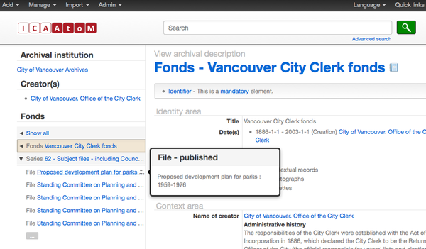
- Vertical presentation is added to resolve nesting display issues reported in 1.2 - all levels of description are given equal screen real-estate in the context menu, and the treeview alters the view in response to the record selected.
- Arrows are used to indicate if a level includes descendents and can be opened further to reveal children
- Parent and immediate descendent are open at the same time, all other descendents and siblings are closed until selected
- Highlight is used to indicate specific archival description being viewed
- Users can sort descendents within a level by using drag-and-drop. See the "Natural Sort" discussion below for additional information.
- In response to usability feedback about description titles being truncated in the treeview, a hover pop-up is added to reveal full description title
- In response to user feedback about being redirected to a browse page when clicking "see all" in the treeview, users are now able to see all descendants without leaving the treeview
- As in 1.2 a set number of child descriptions is loaded (10)
- Ellipses at bottom of treeview enable User to open additional descendents
- As the user scrolls, the list will auto-populate with further results
Treeview in Terms view page
- Vertical presentation
Next Steps
- A review of Treeview functionality in ICA-AtoM 1.3, identified two key problems to be fixed and released as a 1.3.1 Patch:
- Issue 2406: Displaying all fonds in the database in the Treeview is confusing
- Issue 2409: Default Treeview should present entire hierarchy with all descendents
- Additionally, problems with viewing archival descriptions in treeview while working in languages other than English have been reported by users of 1.3:
- Issue 4409: Treeview shows duplicate entries in language other than English
- Issue 4410: Title of archival description dropped from Treeview in Language OTHER than English
- Further community consultation on future improvements and changes to Treeview will be implemented as well (see below):
Use Case Reviews and Possibilities for Treeview Development
In an effort to remain transparent, responsive to user feedback, and to better outline the challenges and opportunities that further Treeview development presents, Artefactual Systems (lead developers of the AtoM application) has prepared the following table, based on comments and suggestions received via the AtoM user discussion forum. In each case, Artefactual's systems analysts have attempted to outline a summary of the feedback received, the requirements for an ideal outcome that would resolve the issues noted in the feedback, and several potential solutions that might be incorporated into the development roadmap. Artefactual developers will then review the possible solutions and post commentary on what is feasible given the coding structure, as well as an estimate of development costs associated with the proposed improvement.
As the chart is developed, Artefactual intends to invite further user feedback on the proposed solutions, as a means of garnering a community consensus on the development roadmap for Treeview in AtoM's 2.x releases and beyond. Artefactual is exploring the best means to gauge community interest on these possible solutions, and may incorporate the use of simple user polls via Survey Monkey or similar public services. Users are also invited to submit wireframes and mockups for potential solutions - either via freely available, web-based wireframe programs such as Moqups, or through personal wire-frame software design submissions. These will be hosted on the Treeview wiki page, and users will be encouraged to discuss the solutions via the User Discussion Forum.
Tell us what you think in the ICA AtoM User Discussion Forum: we have a discussion on Treeview already started, and would love to hear from users about their preferred solutions from the chart below!
| Feedback / Use Case Issue | Use Case Requirements | Possible solutions | Projected Development Costs | Developer Comments |
|---|---|---|---|---|
| Default display of all collections/fonds in a repository is confusing for users, especially as the default view (user comments: 1, 2, 3, 4, 5, and 6). | Users should have the ability to change this default, or default display should not show all collections/fonds | Default display is changed to show the top-level description currently in the show screen at the top of the treeview, with its children visible beneath | - | Expected to be released by Artefactual as a 1.3.1 Patch |
| Same as above, AND the “Show All” option (currently in Treeview when a top-level description is selected and its children opened) is maintained as a visually separate option above the treeview, allowing users to see all fonds/collections in the current repository. | $1,000 | (comments here) | ||
| Default display is changed as above, AND a separate list of all records in the repository is placed elsewhere in the context menu (vertical list, top level only) | $2,000 | (comments here) | ||
| Add a treeview section to the Admin > Settings menu that would allow administrators to set default display behaviours: whether or not a record viewed in the show screen is displayed as collapsed or open in the treeview; whether or not all fonds/collections in a repository can be viewed in treeview, etc. | $1,000 | (comments here) | ||
| Feedback / Use Case Issue | Use Case Requirements | Possible solutions | Projected Development Costs | Developer Comments |
| Default display of a record being viewed in the show screen appearing collapsed in the treeview (i.e., not displaying its children) can be confusing for users; difficult to navigate (user comments: 1, 2, 3, 4, 5, 6). | Users should have a clear sense of context when viewing a record in the show screen, including children descriptions | Default display is changed to show the top-level description currently in the show screen at the top of the treeview, with its children visible beneath | - | Expected to be released by Artefactual in Release 1.4 |
| Change default display, AND add a dedicated button (either in context menu or at bottom of show screen) “Browse children”, that will take users to a browse results page similar to 1.2’s hierarchy browse, but with added context | $1,000 | (comments here) | ||
| Change default display, AND add a dedicated browse children bar at the bottom of the show screen that will open children browse results in the same screen, accordion-style (max 25 results at a time, option to repeat request) | $7,500 | (comments here) | ||
| Feedback / Use Case Issue | Use Case Requirements | Possible solutions | Projected Development Costs | Developer Comments |
| Determining number of children beneath a description is difficult to establish ; user does not know how far down they will have to navigate (user comment). | Treeview should display a count of children somewhere that is clear and accessible | Add a simple children count to the hover menu of any parent description | $1,000 | (comments here) |
| Add a child count to the record show screen | $750 | (comments here) | ||
| Add a child count (either in context menu or show screen), AND add a “Browse Children” button that will take the users to an improved version of the 1.2 hierarchy browse results page | $2,000 | (comments here) | ||
| Add a new section to the context menu above or beneath the treeview that would provide further contextual information to a selected record, including number of children, and title (link) / identifier of last child | $1,500 | "replace context menu with additional information in the treeview node popup" | ||
| Feedback / Use Case Issue | Use Case Requirements | Possible solutions | Projected Development Costs | Developer Comments |
| 1.3 use of triangle icons for treeview hierarchy navigation less intuitive than 1.2’s “Explorer” style + buttons; users sometimes challenged in navigation, interface less intuitive (user comment). | Administrators should have ability to revert to old icons, or select icons from a predefined list of options | Release an optional icon changing plugin that will maintain the current vertical browse of treeview, but replace current icons with “Explorer” style icons from AtoM 1.2 | X | "This would require maintaining a separate theme plugin for a few icon changes, which is not sustainable for Artefactual. We encourage our community to develop a theme that fits this use case if the desire for it is strong." |
| Include 2-4 icon options in an Admin > Settings > Treeview page | $1,000 | (comments here) | ||
| Allow administrators to choose between 1.2 treeview and 1.3 treeview in an Admin > Settings > Treeview page | X | "This would massively increase the codebase of the AtoM application, and the 1.2 treeview had a number of issues that would need to be resolved. The Artefactual developers are not currently considering this an option" | ||
| Feedback / Use Case Issue | Use Case Requirements | Possible solutions | Projected Development Costs | Developer Comments |
| Displaying the Draft/Published status of a record in the Treeview hover popup is confusing for users who understand the word “published” to mean something different; other useful information could be contained in the hover (user comment). | Administrators should have the ability to determine if the Draft/Published status appears in the treeview hover pop-up; ideally Administrators should be able to determine exactly what appears in the hover pop-up | Remove publication status from hover pop-up entirely | $125 | In AtoM 2.0, publication status does not appear in the hover tooltip for unauthenticated users. If a user is authenticated (i.e. logged in with permissions to view draft records, "(Draft)" will appear in next to the title in the hover tooltip for draft records - the word "published" has been removed entirely for clarity. |
| Set publication status in hover to appear only when user is logged in as authenticated user (non-authenticated users see only level and title) | $375 | See above - this has essentially been implemented in AtoM 2.0 | ||
| Set publication status in hover to appear only when authenticated user has editor permissions or above | $375 | (comments here) | ||
| Add admin controls for hover behavior display: publication status, date range, identifier, title included as options | $2,000 | (comments here) | ||
| Feedback / Use Case Issue | Use Case Requirements | Possible solutions | Projected Development Costs | Developer Comments |
| Users cannot view all records in a finding aid in one screen, limiting context; Report mode cuts out information; current dependence on treeview for navigation limits users in terms of W3C content accessibility guidelines (user comments 1, 2). | Users should have a way to view an entire finding aid on one page without losing the broader context, or information provided in the show screens (user suggestion). This option should also be available in Report Mode, for printing and simplified viewing | Make the current report option more robust, so no information from the show screen is lost in the report | $10,000 | "using xslt to render xml as html plus css and printing format compatibility" |
| Make the Report Mode more robust, AND Incorporate an ability to view and expand child descriptions dynamically within the same page – accordion style browse-hierarchy results (not full record) at the bottom of the current show screen, each which can be expanded further | $15,000 | "performance issues, limited to direct descendants only and dynamic loading in chunks of 25" | ||
| Make the Report Mode more robust, AND incorporate Treeview elements into the showscreen itself – either under the Scope and Content field or at the bottom of the Description show screen | $20,000 | "Full treeview included in body of record" | ||
| Feedback / Use Case Issue | Use Case Requirements | Possible solutions | Projected Development Costs | Developer Comments |
| Clicking on the title of a record currently displayed in the showscreen in the treeview simply reloads the current page; users often confuse this with the arrow to open the children, reducing usability (user comment). | Record currently being displayed in the show screen should not be displayed as a link leading to the same show screen page in the treeview | Remove link from the record currently being displayed | $125 | (comments here) |
| Remove link as above, AND make entire label in treeview open children when clicked (rather than just clicking the arrow icon to open) | $500 | (comments here) | ||
| Feedback / Use Case Issue | Use Case Requirements | Possible solutions | Projected Development Costs | Developer Comments |
| No way to remove Unit Identifier information from treeview display; often titles are not visible when long Unit ID’s have been used, making navigation in treeview harder for users (user comment). | Administrators should have the ability to control field display in treeview labels, turn off and on display elements such as Unit Identifier | Add an Admin display control to turn on/off Unit ID display in treeview labels in a new Admin > Settings > Treeview menu | $1,000 | (comments here) |
| Feedback / Use Case Issue | Use Case Requirements | Possible solutions | Projected Development Costs | Developer Comments |
| The context menu does not currently offer enough screen real estate to take advantage of collapsible levels and nested hierarchical browsing; all contextual navigation within a fonds must be done through treeview (user comments 1, 2). | Users require a means of full-screen browsing through descriptions, that maintains hierarchical context and other useful descriptive information (identifier, year range, repository, part of, extent, level of description, etc.) | Implement treeview functionality with nesting into the description show screen at the fonds level, beneath the fonds description (user suggestion). | $2,500 | "We don't recommend this solution because many users won't see the treeview if it is located after the full description." |
| Limit treeview to current fonds + its series (+ all sub-series levels); move file and item lists/links showscreen of the parent description as its own area at the end of the description; Add breadcrumb trail links at the head of the description to the parent levels so immediate context is always visible (user suggestion). | $5,000 | "Breadcrumb is part of 2.0. We don't encourage implementing this solution because it doesn't solve the problem with not having enough space to show full fond/series/subseries title and it also brings the problem of the case described above, with the added confusion that the hierarchy is now broken into two different parts in the screen." | ||
| Add the ability to expand and pin treeview to full page view; employ visual nesting rather than vertical view with increased screen space when pinned open | $7,500 | "Analysis needs to be done regarding descriptive data not being visible while viewing full treeview." | ||
| Add the abilty to expand and pin treeview into a 2-pane full-screen view, where one side shows treeview with nested hierarchies, and other side displays whatever content is selected, without the treeview collapsing or reordering on select | $5,000 | (comments) | ||
| Offer a Toggle to full-screen Miller Column view, where users can determine the sort of each column, limit by repository, by date, etc. Showscreen for last record selected is displayed below the Miller column (top 3rd of screen) | $20,000 | Example of implementation elsewhere: http://eadview.lds.org/findingaid/CR%20100%20137 | ||
| Re-implement a better variation of 1.2’s separate hierarchy browse screen, with added contextual fields and the ability to expand a displayed record with children in page (ex: collapsible accordion, 25 children descriptions added at a time, ability to repeat request) | $ | (comments here) | ||
| Same as above, AND keeping the Treeview in the page when the user redirects to a separate hierarchy browse screen | $ ??? | "This possibility requires some clarification around how treeview and browse functionality would interact." | ||
| Incorporate dropdowns that appear on hover, as in the Suckerfish Dropdowns example provided, so that all levels of hierarchy can be explored dynamically and in context | $ | (comments here) |
Developer Discussion (1.x)
+XX .. link
- As part of the Scalable UI controls upgrades the total number of resources shown in the Treeview was restricted. In cases where there are more than ten (10) resources at any level of the hierarchy, only the first 10 resources will be displayed, with an +XX... link showing the number of hidden resources at that level. Clicking the link will expand that branch to show all descriptions at that level.
- Original discussions on this requirement can be found in issue 1068, and more specifically, issue 1303.
- Behaviour:
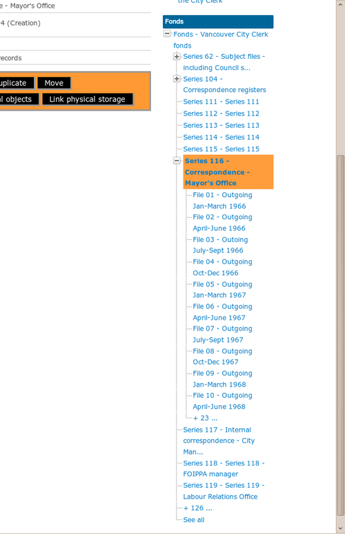
- The +XX .. button appears only when there are more than 10 children or more than 10 siblings for the current branch on the show screen (see Figure 1);
- Any object that has more than 10 children displays the first 10 children followed by a number indicating how many children are hidden (see examples in screenshots - + 23..., +126 ... etc.)
- The +XX .. button shows a spinner as soon as you click it indicating some activity that an AJAX request is being processed
- When the Ajax response is returned, then the treeview is dynamically expanded, and all resources in that branch are shown
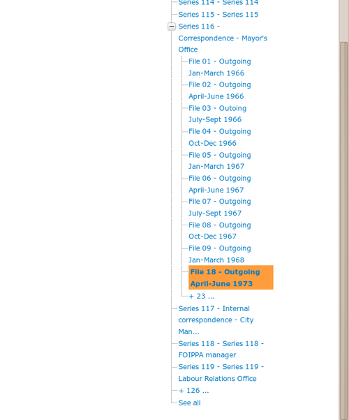
- When viewing an information object that is sorted further down the sibling list than the first 10 siblings, show the first nine objects in the list, then the current object as the 10th item in the sibling list (See Figure 2)
- Reloading the page or clicking a link to another resource in the current hierarchy resets the Treeview to the default state
Natural sort
Sorting the treeview by title or identifier+title (available in the Admin > Settings > Global) often produces unexpected results because they are not sorted in "natural" order.
For instance, identifiers:
- IMG 1
- IMG 2
- IMG 10
- IMG 11
- IMG 100
Currently sort as:
- IMG 1
- IMG 10
- IMG 100
- IMG 11
- IMG 2
See http://www.codinghorror.com/blog/2007/12/sorting-for-humans-natural-sort-order.html for a description of natural sort vs. "ASCII" order (though note that MySQL is case-insensitive for sorts).
Adding Natural sort to SQL
MySQL [1] and PostgreSQL [2] do not support natural sort natively.
A web search for "MySQL natural sort" brings up numerous posts on how to do natural sorting in MySQL, but they are mostly too simplistic (i.e. they sort by length of string, then by string, which only works in some cases).
There is a fairly robust natural sort for MySQL/PostgreSQL using stored procedures http://drupalcode.org/project/natsort.git/tree/refs/heads/5.x-1.x but the README indicates that this procedure is quite slow, and thus it uses a hash table to compensate. This raises issues of trying to maintain the hash table when data values change. Using stored procedures also has administrative and security implications.
Pre-sorting
Another option is to do the sorting on the backend
- Administrator would select a fonds, series, etc.
- There would be a "sort" button that would allow sorting the fonds, series, etc. children by title or identifier+title
- Clicking the "sort" button would re-order the children permanently by updating the Nested set values or by populating a hash table
Pros:
- Front end sort is fast, because it's using simple nested set sort, or hash table
- Can be slow on the backend, if it only needs to be run occassionaly
- Can use existing PHP natsort() functions, instead of writing our own in MySQL
- Administrator can tweak arrangement afterwards if there are anomalies with Drag-n-drop sorting feature
Cons:
- Sorting I18n values is impossible with nested set sort, but possible (if complicated) with by introducing a "culture" column to a hash table
- Hash table maintenance issues?
- Sort table + Nested set is somewhat redundant and may conflict


