Difference between revisions of "Development/Projects/ArchivesCanada/Wireframes"
m (Add related link) |
m (→March 2012 wireframes: Fix image tag) |
||
| (One intermediate revision by the same user not shown) | |||
| Line 8: | Line 8: | ||
* [[Development/Projects/ArchivesCanada/Planning#2011_Discussion:_User_Interface_Search_.26_Early_Mockups|ArchivesCanada 2011 Planning - Early mockups]] | * [[Development/Projects/ArchivesCanada/Planning#2011_Discussion:_User_Interface_Search_.26_Early_Mockups|ArchivesCanada 2011 Planning - Early mockups]] | ||
</admonition> | </admonition> | ||
| + | |||
| + | |||
| + | == January 2012 wireframes == | ||
| + | |||
| + | After a series of meetings and discussions, the first round of Search and Browse Wireframes have been created by the UX Architect for ARCHIVESCANADA for review. Building on the new Trillium theme, released with [[Releases/Release_announcements/Release_1.2|ICA-AtoM 1.2]], these wireframes act as a visual guide to represent the content, functionality and navigation proposed for the ARCHIVESCANADA upgrade: | ||
| + | |||
| + | *[[File:ArchivesCanada Search and Browse Wireframes-1.pdf]] (PDF, 4MB) | ||
| + | |||
| + | |||
| + | Feedback from CCA is integrated into final Search and Browse Wireframes: | ||
| + | *[[File:ArchivesCanada Search and Browse Wireframes-2.pdf]] (PDF, 5MB) | ||
| + | |||
| + | |||
| + | '''UI Design of Browse and Search templates''' | ||
| + | |||
| + | *[[Media:ArchivesCanada_UIDesign_BrowseSearch.pdf|ArchivesCanada_UIDesign_BrowseSearch]] (PDF, 615KB) | ||
| + | |||
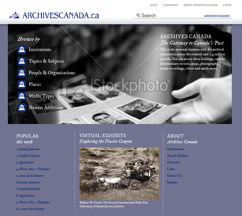
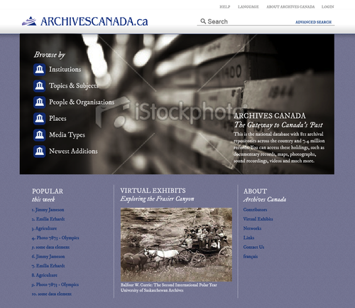
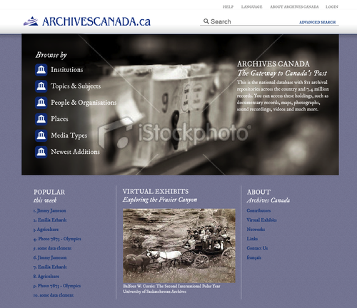
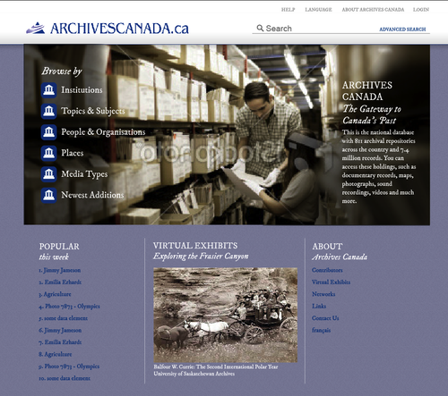
| + | Feedback from CCA prompts a new Homepage design that provides site visitors with immediate access to searching the holdings and convenient links to ARCHIVESCANADA virtual exhibits, contact information etc. Homepage design is shown below with five different background images. CCA feedback is required to select one background image. | ||
| + | |||
| + | [[File:ArchivesCanada-Homepage-option01.png|center|thumb|500px|ArchivesCanada Homepage Option 01]] | ||
| + | [[File:ArchivesCanada-Homepage-option02.png|center|thumb|500px|ArchivesCanada Homepage Option 02]] | ||
| + | [[File:ArchivesCanada-Homepage-option03.png|center|thumb|500px|ArchivesCanada Homepage Option 03]] | ||
| + | [[File:ArchivesCanada-Homepage-option04.png|center|thumb|500px|ArchivesCanada Homepage Option 04]] | ||
| + | [[File:ArchivesCanada-Homepage-option05.png|center|thumb|500px|ArchivesCanada Homepage Option 05]] | ||
| + | |||
| + | |||
| + | <admonition type="note">The final background image will be high-resolution and will not include a watermark. The design work for the icons for the different entity types (institutions, topics & subjects, people & organizations, etc) will be completed in early February 2012.</admonition> | ||
| + | |||
| + | ==February 2012 wireframes== | ||
| + | |||
| + | Begin development of ICA-AtoM 1.3 Search and Browse templates according to final UI design. | ||
| + | |||
| + | Set2 Wireframes represent the content, functionality and navigation proposed for the ARCHIVESCANADA upgrade specific to: Advanced Search, Admin Import, Digital Object upload and Browse Archival Descriptions Treeview. This document is posted for CCA review. | ||
| + | |||
| + | *[[File:ArchivesCanada Wireframes_Set2.pdf]] (PDF, 2.65MB) | ||
| + | |||
| + | |||
| + | Feedback from CCA implemented into Import process - resulting in a clarification of draft status and the addition of a Publish All option within the Import approval process. See revised set of wireframes: | ||
| + | |||
| + | *[[File:ArchivesCanada Wireframes_Set2.2.pdf]] (PDF, 2.65MB) | ||
| + | |||
| + | |||
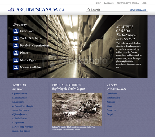
| + | Feedback from CCA selected the image from '''Homepage Option 02'''. A set of ICONS were designed to aid in User navigation and improve quick browse capabilities. The new homepage design is shown below and incorporates the Archives Canada new "look and feel": | ||
| + | |||
| + | [[File:Homepage_Icons.png|center|thumb|500px|ArchivesCanada Homepage w/Icons]] | ||
| + | <br / > | ||
| + | |||
| + | '''UI Wireframes for Mobile-friendly access to ArchivesCanada site''' | ||
| + | |||
| + | * [[File:ArchivesCanada Wireframes-Mobile.pdf]] (PDF, 1.1MB) | ||
| + | |||
| + | |||
| + | ==March 2012 wireframes== | ||
| + | |||
| + | New Icon design for CCA review: | ||
| + | |||
| + | [[File:Icons-finalset.png|center|thumb|500px|Icons, revised design]] | ||
| + | |||
| + | ==June 2013 - ArchivesCanada Beta site== | ||
| + | |||
| + | Between the 2012 wireframes and icons and the initial test launch of the [http://archivescanada.accesstomemory.org/ ArchivesCanada Beta] site (released for initial feedback just prior to the Canadian Association of Canadian Archivists conference), several more minor changes to the final icons and the home page layout were undertaken. Below is a screenshot of the ArchivesCanada Beta homepage: | ||
| + | |||
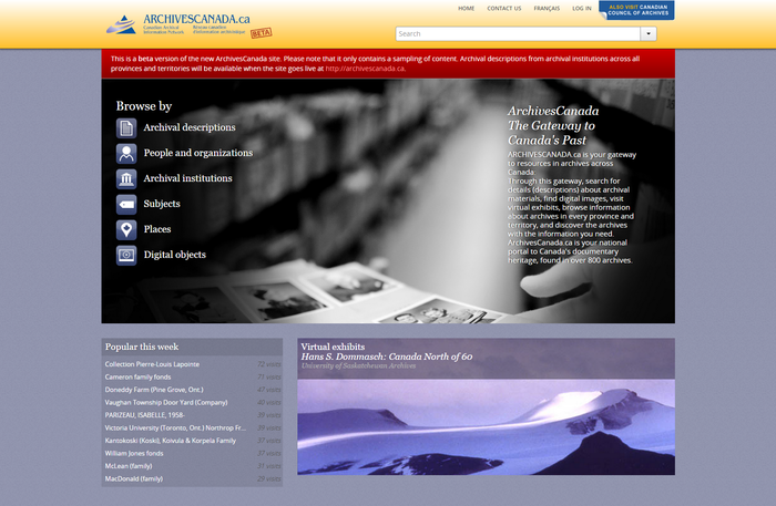
| + | [[File:ArchivesCanadaBeta2013.png|center|thumb|700px|An image of the ArchivesCanada Beta homepage, showing the final icon set used]] | ||
Latest revision as of 16:37, 21 August 2015
Main Page > Development > Development/Projects > Development/Projects/ArchivesCanada > Wireframes
This section of the ArchivesCanada upgrade project documentation includes a gallery of wireframes prepared in 2012 as part of the project analysis and planning phase - many of which lead to the redesign of features included in the v2.0.0 and subsequent AtoM releases.
Contents
January 2012 wireframes
After a series of meetings and discussions, the first round of Search and Browse Wireframes have been created by the UX Architect for ARCHIVESCANADA for review. Building on the new Trillium theme, released with ICA-AtoM 1.2, these wireframes act as a visual guide to represent the content, functionality and navigation proposed for the ARCHIVESCANADA upgrade:
Feedback from CCA is integrated into final Search and Browse Wireframes:
UI Design of Browse and Search templates
- ArchivesCanada_UIDesign_BrowseSearch (PDF, 615KB)
Feedback from CCA prompts a new Homepage design that provides site visitors with immediate access to searching the holdings and convenient links to ARCHIVESCANADA virtual exhibits, contact information etc. Homepage design is shown below with five different background images. CCA feedback is required to select one background image.
Note
The final background image will be high-resolution and will not include a watermark. The design work for the icons for the different entity types (institutions, topics & subjects, people & organizations, etc) will be completed in early February 2012.
February 2012 wireframes
Begin development of ICA-AtoM 1.3 Search and Browse templates according to final UI design.
Set2 Wireframes represent the content, functionality and navigation proposed for the ARCHIVESCANADA upgrade specific to: Advanced Search, Admin Import, Digital Object upload and Browse Archival Descriptions Treeview. This document is posted for CCA review.
- File:ArchivesCanada Wireframes Set2.pdf (PDF, 2.65MB)
Feedback from CCA implemented into Import process - resulting in a clarification of draft status and the addition of a Publish All option within the Import approval process. See revised set of wireframes:
- File:ArchivesCanada Wireframes Set2.2.pdf (PDF, 2.65MB)
Feedback from CCA selected the image from Homepage Option 02. A set of ICONS were designed to aid in User navigation and improve quick browse capabilities. The new homepage design is shown below and incorporates the Archives Canada new "look and feel":
UI Wireframes for Mobile-friendly access to ArchivesCanada site
- File:ArchivesCanada Wireframes-Mobile.pdf (PDF, 1.1MB)
March 2012 wireframes
New Icon design for CCA review:
June 2013 - ArchivesCanada Beta site
Between the 2012 wireframes and icons and the initial test launch of the ArchivesCanada Beta site (released for initial feedback just prior to the Canadian Association of Canadian Archivists conference), several more minor changes to the final icons and the home page layout were undertaken. Below is a screenshot of the ArchivesCanada Beta homepage:


