ArchivesCanada: Initial project planning
From AtoM wiki
Main Page > Development > Development/Projects > Development/Projects/ArchivesCanada > Planning
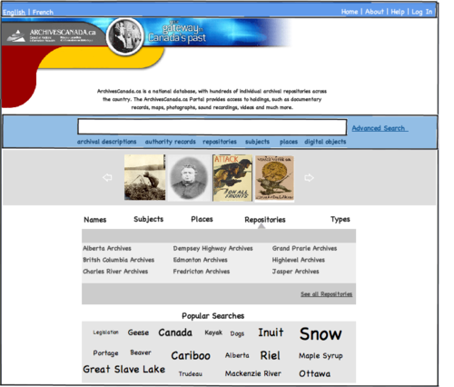
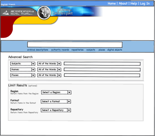
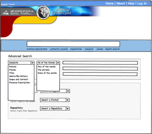
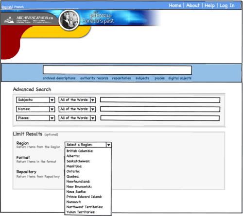
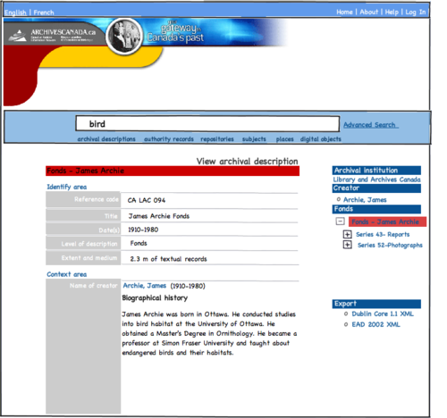
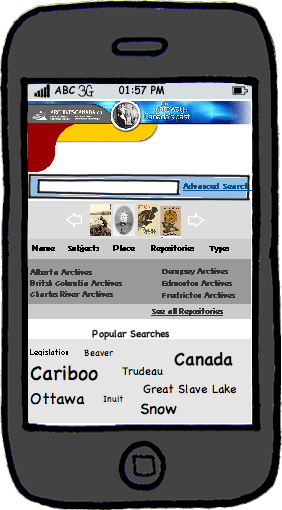
This section of the ArchivesCanada upgrade development project documentation includes documentation from 2011-2012, which describes the initial project goals and planning process of the project, including a review of search and advanced functionality on other related sites, usability research, and early 2011 wireframes for the initial design.
_ _Background to Search
Preliminary discussions about Searching revealed the need to clarify different approaches and their functionality.
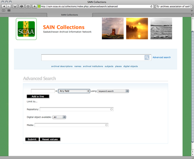
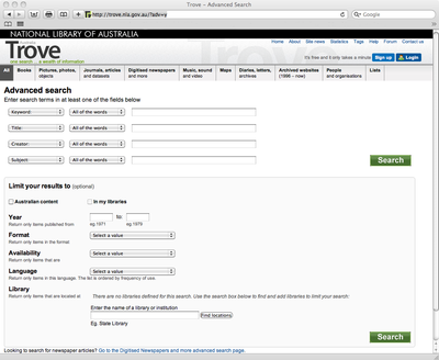
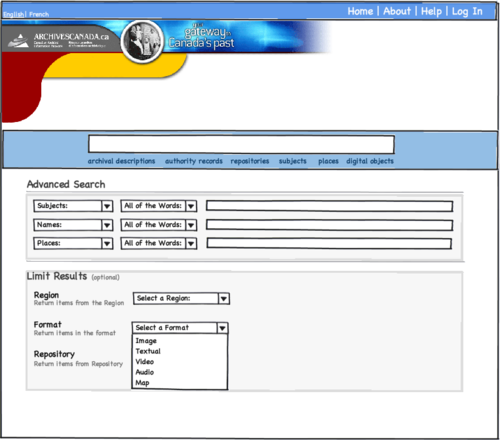
- Advanced Search
- Offers the user the ability to narrow their searches by a series of filters. The user can select certain fields for searching, such as Creator, Date, or Place.
- Example: Saskatchewan Archival Information Network.
- Example: Trove - The National Library of Australia
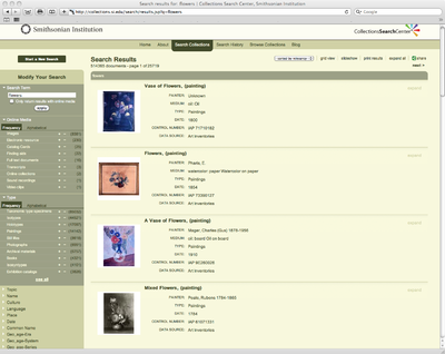
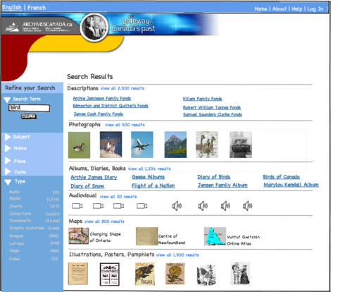
- Faceted Search
- Offers the user the ability to navigate a multi-dimensional information space by combining text search with a progressive narrowing of choices in each dimension. Check boxes and links enable users to drill into search results. Each facet displayed will show the number of hits within the search that match that category.The advantage of faceted searching is that it enables users to become familiar with the scope and nature of the content available.In doing so, the user becomes aware of the taxonomies associated with the data.
- Example:Smithsonian Institution Collections Search Center
- Further Reading: Smithsonian Institution Research Information System, Tech Article
- Marti A. Hearst, UIs for Faceted Navigation. Recent Advances and Remaining Problems
- Dolphin, the file browser in KDE (a linux desktop) introduced a faceted search, Dophin Screenshot
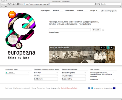
- Portal Search
- Offers the user a website that features a suite of services. A portal presents information from diverse sources in a unified way. Portal services often include a search engine or directory, databases, maps, forums etc... A large enterprise can use a portal to provide a consistent look and feel while providing the user with access to multiple applications and databases, which would usually be discrete entities.
- Example: Europeana Portal
2011 Discussion: User Interface Search & Early Mockups
Note
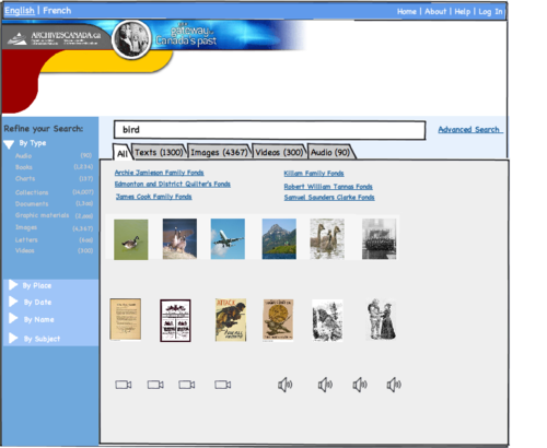
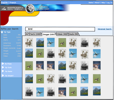
These early mockups address user interface controls and layout. Graphic design will be addressed in a separate process.
Development Comments:
- Data sources/ quality
- Being able to offer browse and faceted results is only possible if the source data has been indexed with subjects, place, names, format types, etc. The other issue is the limited availability of item-level descriptions and providing an interface that blends fonds/collection level descriptions (incl. hierarchy display) smoothly with item-level descriptions.
Relevant Literature:
- See, D-Lib Magazine's recent feature article on Developing Mobile Access to Digital Collections, written by Carmen Mitchell and Daniel Suchy.


